



Book Interior Design: Layout, Typography, and Readability That Keep Readers Turning Pages
Introduction: Why Book Interior Design Matters
From the cuneiform tablets of circa 3200 BC to the oldest surviving printed book - a Korean scroll from around 700 AD - to Johannes Gutenberg's invention of movable type around 1450 in Europe, the art of presenting words on a page has always shaped how readers absorb ideas. By the 19th century, steam-powered presses could print 1,100 sheets per hour, and the codex format had been dominant since Late Antiquity in the Roman world. Yet even with all that progress, a poorly designed book interior still drives readers away.
Book interior design is the invisible architecture of your story or argument. It determines whether someone finishes your book or sets it down after ten pages. Successful interior design incorporates function and human experience - the same principle that guides any well-crafted space. When typography and layout work, readers forget they are reading. When they fail, fatigue and confusion take over.
Consider the difference: a cramped paperback with 8pt body text and razor-thin margins feels cheap, hard to read, and exhausting. A well-designed edition using 10.5–11pt serif body copy with balanced white space invites the reader in and holds them there. That gap is where tens of thousands of book sales, reviews, and reader loyalty are won or lost.
This post focuses strictly on interior layout - not cover design and not generic formatting services. The guidance applies to trade paperbacks, hardcovers, and print-on-demand self publishing, with a few notes on ebook files where relevant. Whether you write fiction or non fiction, children's books or memoir, the principles here will help you publish with confidence.
If you want professional support with your book's interior, Masterly Publishing Group offers publishing consultations to help you get it right.
Core Principles of Effective Book Interior Design
Interior design relies on balancing several core principles, and book layout is no different. If a reader notices the design, something is usually wrong. Here are the fundamentals:
- Hierarchy. A clear visual hierarchy - title, chapter heading, subheading, body text, captions - guides the eye the way a focal point is an anchor in a room that draws the eye. Each element acts as a signpost through a 300-page book.
- Rhythm and pacing. Just as rhythm and repetition create visual harmony across a room, choices like line length, line spacing, and white space before a new chapter control reading tempo. Composition principles including balance, rhythm, and contrast apply directly to book pages.
- Consistency. Font sizes, paragraph style, and spacing must stay uniform from front matter through back matter. Inconsistency is the fastest way to look amateur.
- Genre alignment. A clean, structured layout suits business non fiction; a more playful format works for children's books. Overdecorating rarely helps any genre.
Proportion and scale relate an object's size to a space's dimensions - and the same logic governs page design. A 5.25" × 8" novel demands shorter line lengths and tighter margins than a 7" × 10" how-to manual, which has more room for subheads, diagrams, and other elements. The atmosphere of a space impacts the emotional experience of its users; so does the feel of a well-designed book page.
Typography Basics: Choosing Fonts, Font Sizes, and Line Spacing
Interior typography is the foundation of book interior design. Every micro-decision about fonts and spacing affects hours of reading comfort. Here is what matters most:
- Serif vs. sans serif. Most long-form print body text uses serif fonts - Garamond, Minion Pro, Caslon, Baskerville - because their horizontal strokes guide the eye across lines. Sans-serif typefaces work well for headings, workbooks, or modern tech manuals, but they rarely outperform serifs for extended reading of printed materials.
- Font size. Use a serif font at 11 or 12pt for body text. The practical range for adult print books is 10–12pt, with 10pt as the lower bound for general audiences. Older readers and large-print editions benefit from 14pt and above. Lighting affects perceptions of materials and spatial dimensions, and the same is true of type size on paper under different reading conditions.
- Line spacing (leading). Target 1.2–1.4× the font size. For example, 11pt text with 14pt leading gives comfortable breathing room in a standard trade paperback. Too-tight leading causes eye strain; too-loose leading wastes pages and disrupts flow.
- Line length. Aim for 60–75 characters per line. Narrow columns feel choppy; very wide lines make it hard for the eye to track back to the next line. For a 6×9 book, aim for about 350 words per page to hit that sweet spot.
- Font pairing. Stick to two typefaces maximum. Time-tested combinations include Garamond body with Gill Sans headings, Caslon body with Akzidenz-Grotesk display, and Lora body with Nunito Sans headings. More than two fonts on a page almost always looks amateurish.
Color sets the mood and alters the perception of room size - and in book design, the contrast between ink and paper color matters just as much. Cream paper with black text reduces glare for long reading sessions. Headers and footers should be smaller than body text to maintain clean hierarchy.
Quick comparison: Before - 9pt Times New Roman, 11pt leading, 0.4" margins. After - 11pt Garamond, 14pt leading, 0.75" margins. The second version is immediately more inviting and professional.
Page Design Fundamentals: Margins, Grids, and White Space
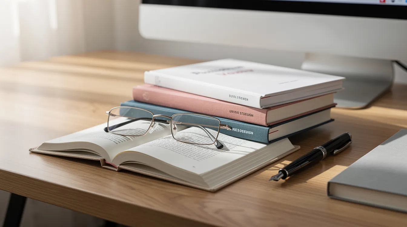
Margins and white space are not wasted room. They are essential to print readability, binding tolerances, and the overall book layout. Materials in interior design include wood, metal, textiles, and glass; in page design, your material is paper, and how you use its space matters.
- Margin ranges. Set margins between 0.6" and 0.8" for text on the outside, top, and bottom. Add 0.3"–0.5" to the inner margin for gutter allowance depending on page count. For a 6" × 9" book of 250–300 pages, a gutter of at least 0.5" prevents text from disappearing into the spine.
- Top and bottom margins. A slightly deeper bottom margin creates balance - the distribution of visual weight on a page - and leaves room for page numbers without crowding the body text.
- Text block placement. Position the text block slightly above the vertical center. A "floating" centered block looks unanchored and unprofessional.
- White space. Generous white space around chapter openings, pull quotes, and illustrations gives the reader's eye a break and signals importance. A book should have at least 200 pages for substance, but white space should never be sacrificed just to hit that number.
- Grids. An invisible single-column grid keeps body text, images, and notes aligned across every chapter. Multi-column grids suit cookbooks and textbooks but rarely trade fiction.
Texture and pattern add depth to a design by varying tactile qualities - and the physical feel of paper stock combined with thoughtful layout creates a similar effect in a reader's hands.
Quick margin checklist:
- Are gutters wide enough for your total page count?
- Does the line length fall between 55–75 characters?
- Are margins proportionally balanced on all four sides?
- Is body text leading between 1.2× and 1.4× the font size?
Structuring Chapters: New Chapter Pages, Headings, and Section Breaks
Good chapter formatting sets expectations and keeps long-form reading organized, especially in non fiction where readers may skim for specific ideas.
- Starting a new chapter. Always begin on a recto (right-hand) page. Use a clear page break in MS Word or your layout software - never multiple hard returns. Leave a blank verso page if needed.
- Chapter headings. Follow a clear hierarchy: chapter number, chapter title, optional subtitle. A common approach is 18–20pt for the title, placed about one-third down the page (the "sink"), with the number above in a smaller or display style. Each chapter opener functions as a focal point that draws the reader's eye and resets their attention. Lighting layers include ambient, task, and accent lighting; similarly, heading layers include number, title, and subtitle - each serving a distinct purpose.
- First paragraphs. The first paragraph after a chapter heading traditionally has no indent. Subsequent paragraphs use a standard indent of 0.25"–0.375".
- Subheads and section breaks. In non fiction, use subheads to break up long chapters and improve skimmability. In fiction, mark scene breaks with three centered dots or a simple ornament. Avoid leaving a scene break at the very top or bottom of a page.
- Using styles. Use styles in Word to maintain consistent formatting. Define paragraph and character styles for body text, headings, and subheads so a single change updates every instance across the manuscript. This is a non-negotiable step before handing files to a book designer.
Example layout - "Chapter 5": Running head in 9pt sans serif at the top outside corner, page number at the bottom center. A 3-inch sink of blank space from the top, then "Chapter 5" in 12pt small caps, followed by the title in 18pt Garamond, and the first paragraph flush left with no indent.
Designing for Different Genres: Fiction, Non Fiction, and Children's Books
Core readability rules stay the same across genres, but visual treatment varies with reader expectations. Interior design should respond to context, culture, and architecture - and genre is the "architecture" of a book collection.
- Adult fiction. Understated chapter design, classic serif body text, minimal decoration. Common trim sizes: 5" × 8" and 5.25" × 8". The writing should be the star, not the layout. Readers expect a clean, immersive experience.
- Non fiction and business books. More visible hierarchy with subheads, bullet lists, callout boxes, and diagrams. Body text stays clean, but the page needs to present information in a skimmable fashion. Larger trims like 6" × 9" or 7" × 10" give more room for illustration and sidebar material.
- Memoirs vs. how-to. Memoir reads like narrative fiction - keep the layout restrained and story-focused. How-to and instructional books need numbered steps, bold headings, and structured layouts inspired by the content's practical nature.
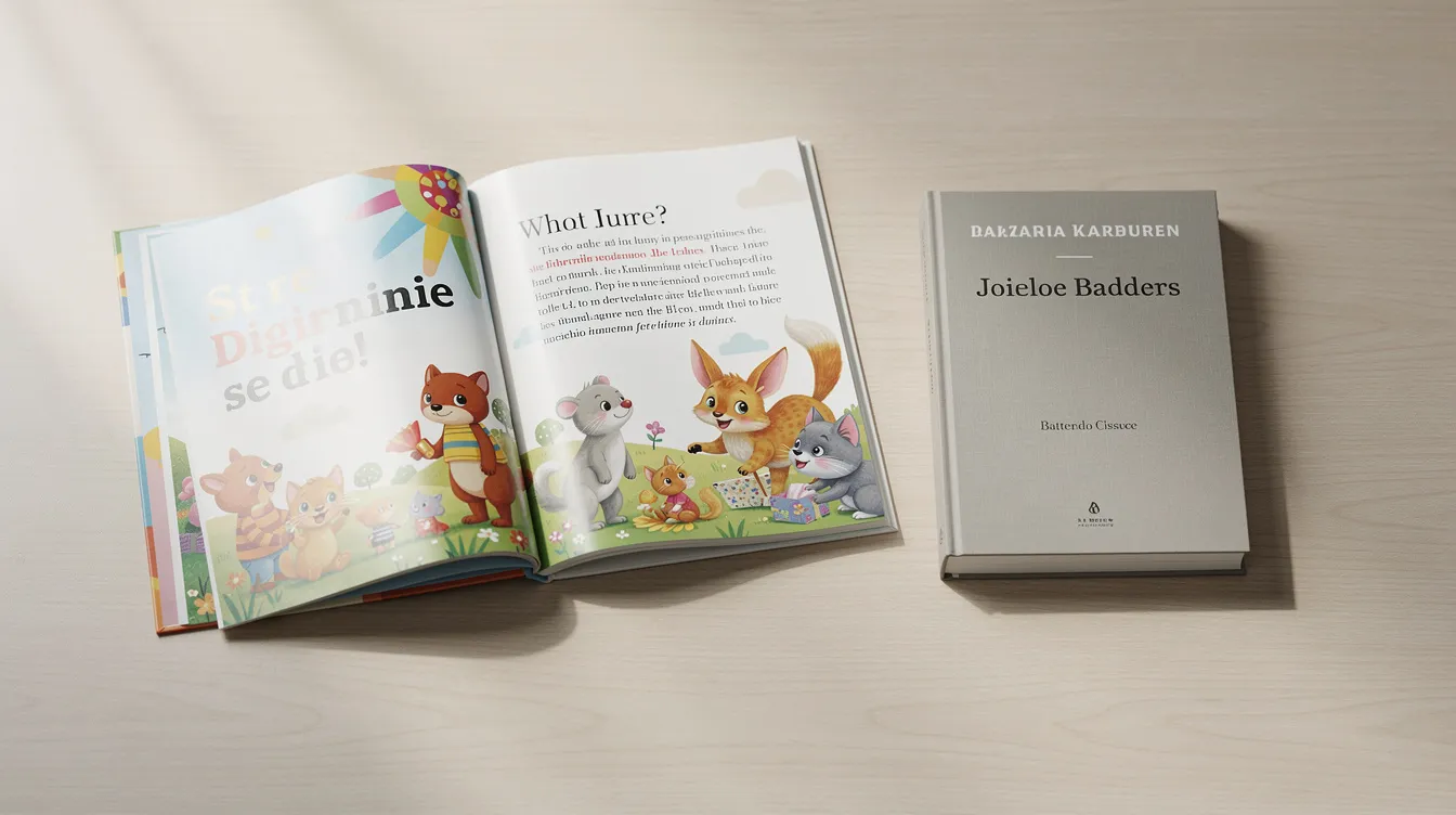
- Children's books. Larger font sizes - often 14–20pt for early readers - shorter lines, generous line spacing, and ample room for full-color images. Picture books are driven almost entirely by illustration placement, while middle-grade chapter books fall closer to adult trims but with more white space and fun, accessible typography. Key elements of interior design include balance, color, and focal point, and these matter even more when your readers are seven years old.
- Educational children's books. Place images on the same spread as related text so young readers can connect words and visuals without flipping pages.
Acoustics are important in spaces like offices and restaurants, and the reading "environment" created by your page design is the book equivalent - it either supports focus or disrupts it. Ralph Lauren's book "A Way of Living" is a highly praised example of how interior design and layout can elevate a book to an art object, not just a collection of words.
Tools and Workflows: From MS Word Draft to Print-Ready Interior
Most authors draft in MS Word, then either refine there or hand the manuscript to a professional book designer. The first widely accepted ebook was created in 1971 by Project Gutenberg, and since then digital workflows have transformed how we move from word to finished page - but the principles of good layout remain unchanged.
- Drafting in MS Word. Use built-in styles for body text, chapter titles, and subheads from the start. Avoid tabs, extra spaces, and manual line breaks. Clean files save hours of work later.
- Preparing files. Keep one master manuscript file. Strip out inconsistent formatting before importing into layout software. Back up everything.
- Professional layout tools. InDesign remains the industry standard for creating print-ready interiors. Affinity Publisher is a capable alternative. These are not word processors - they give you precise control over every element on the page.
- AI design and automation. AI design tools can generate layout concepts, suggest style variations, and speed up template creation. However, they still require human oversight for consistency, genre fit, and print-readiness. Think of them as a starting point, not a finished product.
- Collaboration workflow. The typical path: author delivers an edited manuscript → book designer creates sample pages for approval → full interior layout → proof review → final corrections → print-ready files sent to printer or POD platform.
If you are unsure about tools or file preparation, a professional consultation can save you from costly mistakes and help you customize your interior to match your vision.
Print Readability Checks: Testing Your Interior Before Publication
Screens can be misleading. Final decisions about font size, margins, and layout should always be tested on paper. Technical considerations include lighting infrastructure and building codes in physical spaces; in publishing, they include printer specs, bleed settings, and trim tolerances.
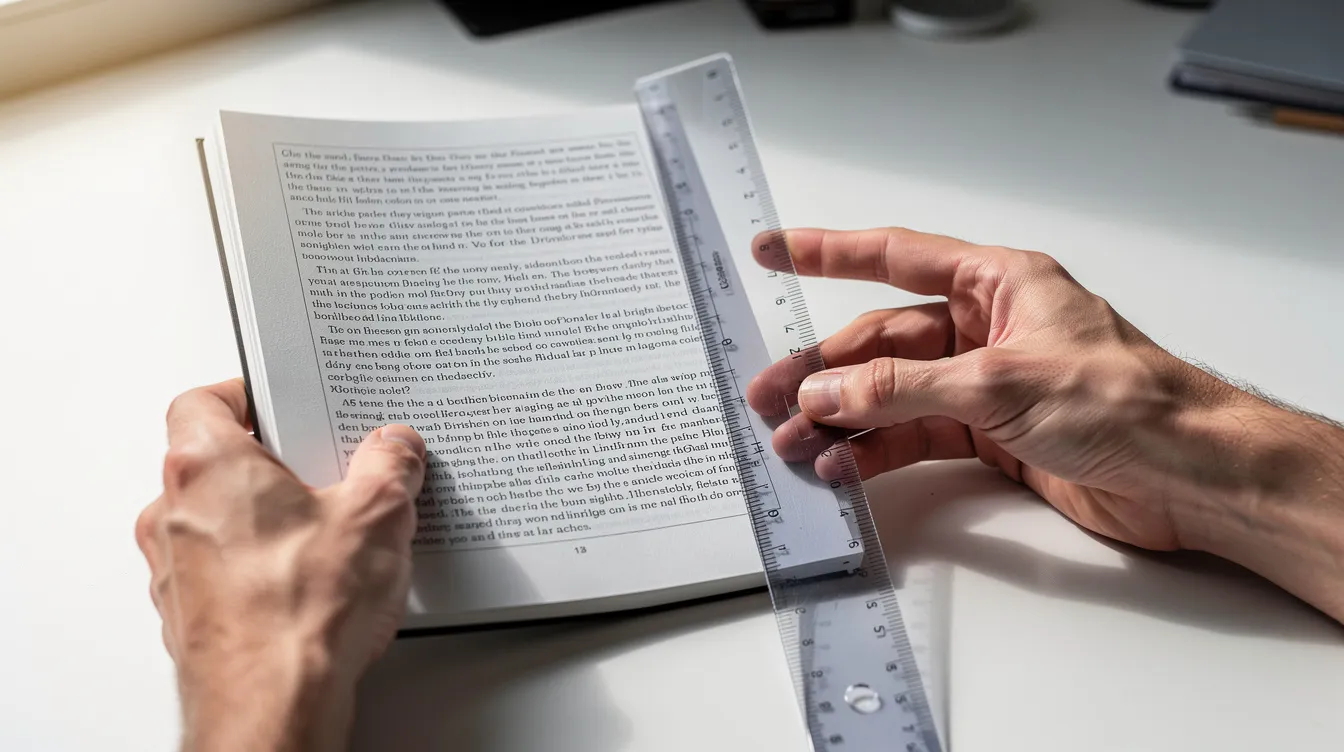
Print-test your font size. Print a few sample book pages at actual trim size. Read for 15–20 minutes continuously. If your eyes tire or you squint, the font size needs to increase.
Review margins and gutters. Simulate binding by clipping or folding printed pages. If body text falls too close to the inner edge, widen the gutter.
Check widows and orphans. A widow is a single line stranded at the top of a page; an orphan is a single line left at the bottom. Both distract readers. Review every page manually.
Color and grayscale. If your book includes images or colored elements, test-print in both color and black-and-white. Ensure contrast and legibility hold up in grayscale for paperback editions.
Accessibility. Test with readers of different ages and visual abilities. This is especially important for non fiction and children's books aimed at broad audiences.
Pre-publication checklist:
- Body text comfortable at actual trim size
- Margins and gutter sufficient for binding
- Styles consistent across all chapters
- No widows or orphans
- Images legible in both color and grayscale
- Fonts embedded and properly licensed
Common Interior Design Mistakes in Self Publishing (and How to Avoid Them)
Self publishing gives you complete control over your own work - but that freedom comes with responsibility. Traditional publishers have entire teams handling interior layout. When you publish independently, obvious design issues can undermine even excellent writing.
- Inappropriate font choices. Using default Calibri for body copy, novelty typefaces, or mixing three or more fonts on a single page signals amateur work. Stick to proven serif faces for body text.
- Inconsistent font sizes and spacing. Copy-pasting from multiple sources without normalizing styles creates a patchwork look. Always reapply your defined paragraph styles after pasting.
- Cramped pages. Shrinking the font size and margins to reduce page count backfires. Readers perceive the result as cheap, and print readability suffers dramatically.
- Sloppy chapter formatting. New chapters starting mid-page, missing page breaks, or inconsistent placement of chapter titles and numbers are red flags that the book was not professionally designed.
- Ignoring print specs. Not matching interior settings - bleed, margins, grayscale images - to printer requirements leads to file rejections or poor output.
- Skipping professional review. Even if you handle layout yourself for personal use, have an experienced formatter or book designer review sample pages before committing to a large print run.
Every one of these issues is fixable. Careful book interior design is an investment in your book's long-term life on library shelves and in private book collections worldwide.
FAQs, Resources, and Next Steps
What is the smallest readable font size for my book's body text? For most adult print books, 10pt is the practical lower bound. For general comfort, 11–12pt is ideal. Children's books and large-print editions should use 14pt or larger.
How do I handle images in non fiction? Place images near the text they support. Test-print in grayscale if your paperback edition is black-and-white. Ensure resolution is at least 300 DPI.
Can AI design fully replace a human book designer? Not yet. AI tools speed up concept generation and offer interesting templates, but a human designer ensures genre fit, consistency, and print-spec compliance. Use AI for inspiration, not as a final authority.
What trim size should I choose? 6" × 9" is the most common for non fiction trade paperbacks. Fiction often uses 5.25" × 8" or 5.5" × 8.5". Your choice affects margins, line length, and page count.
Do these rules apply to ebooks? Ebook format is reflowable, so readers control font size and style. Focus on clean heading hierarchy, proper paragraph spacing, and well-tagged table of contents. The layout world of fixed-page print and reflowable ebook files are fundamentally different.
Where can I find more resources? Print-on-demand platforms publish detailed specification pages for margins, bleed, and trim sizes. Robert Bringhurst's "The Elements of Typographic Style" remains the gold-standard reference. Books are essential tools for home styling and decor - and the same is true for learning the craft of book design itself. Six new interior design books were released in September alone, and titles like "The Perfect Kitchen" show how layout and inspiration shape even niche topics. You can find many design reference books at secondhand stores and on library shelves.
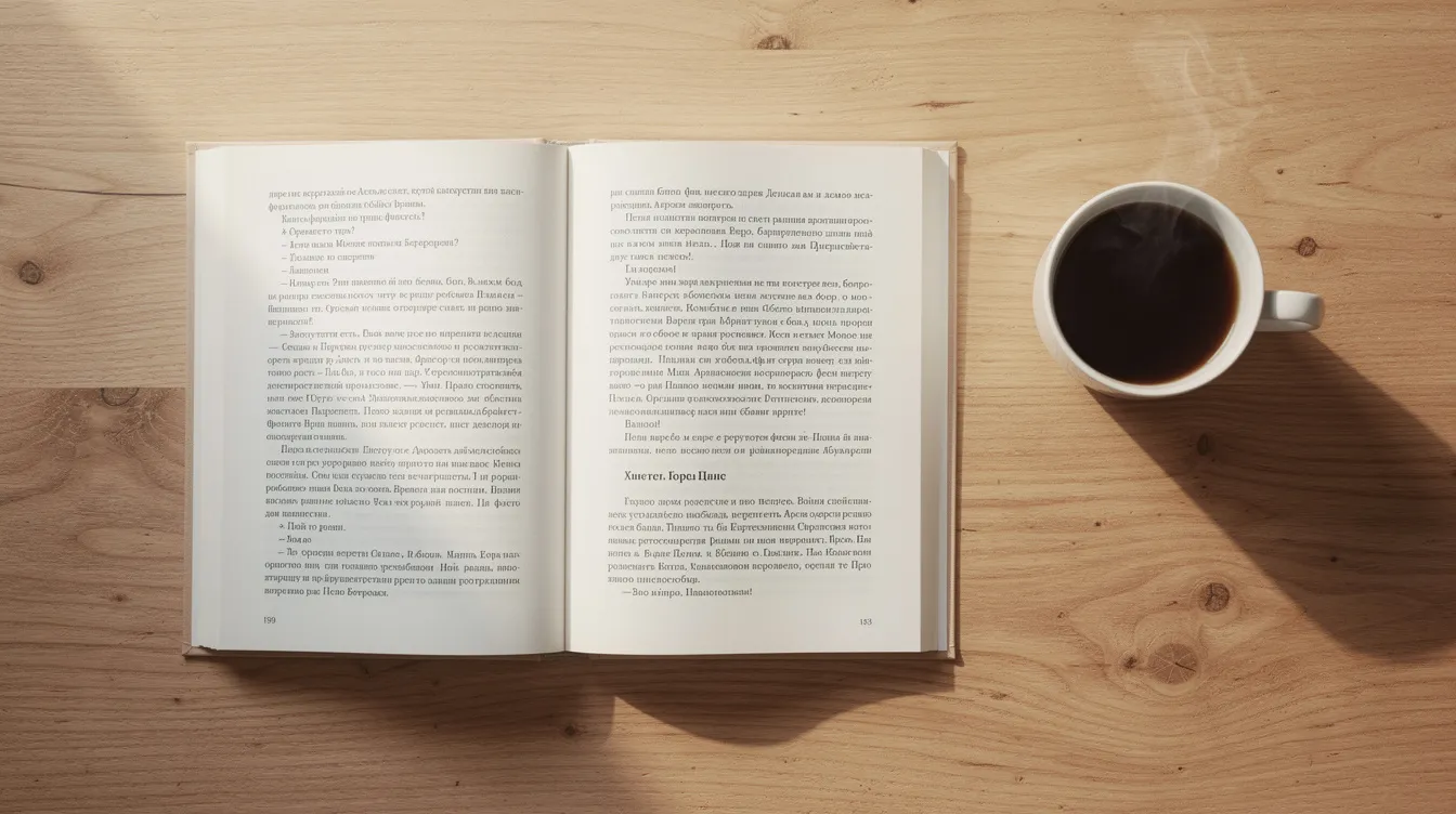
Ready to give your book the professional interior it deserves? Whether you are creating your first novel, a non fiction title filled with diagrams, or a children's book with full-color illustration, your readers will feel the difference that expert page design makes. The world of self publishing rewards authors who invest in quality - and interior design has a tremendous impact on how your book is received.
Request a publishing consultation with Masterly Publishing Group to get expert guidance on book interior design, layout, and print readability. Call (888) 209-4055 or visit masterlypublishing.com to get started.